SED plots introduction
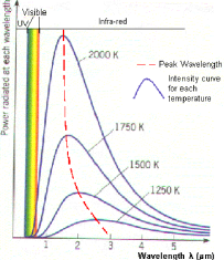
A spectral energy distribution (SED) is a graph of the energy emitted by an object as a function of different wavelengths. The graph at the right is a typical curve, called a blackbody curve. It shows that the amount of energy emitted by the object at all wavelengths varies with the temperature of the object. Hotter objects emit more light at shorter wavelengths than cooler objects; therefore the hotter the object, the more the peak wavelength is shifted toward the left of the graph.
Stars aren’t really blackbodies but the emission from them is very similar to blackbodies. We can "fit" a blackbody curve to the star. Any emission from dust around the stars will then be really obvious because it will show up as "extra" emission (but at a much lower temperature than the star) because the dust is being warmed up by the star. Sometimes this emission can be fit by another much cooler blackbody.
Thermal emission
Things that are warm emit light, including you. You are glowing in the infrared, and the spectrum of your emission looks like the blackbody curve above. Play "toast the robot" to explore how the emissions change as a function of temperature.
SEDs in astronomy
By plotting up the energy emitted by an astronomical object, we can compare at a glance the emissions across a broad range of wavelengths. Does most of the energy come out in the UV or in the IR? The answer to that question can tell us something about what the object is.
NEEDS TO BE EXPANDED SOME MORE
