Difference between revisions of "Color-Magnitude and Color-Color plots Overview"
| Line 14: | Line 14: | ||
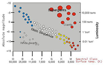
The initial studies of the relation between the absolute magnitudes (equivalent to luminosities) and spectral types (broadly equivalent to temperature) were performed (independently) by Ejnar Hertzsprung (Danish, 1905) and Henry Norris Russell (USA, 1913). Thus the plots of luminosity vs. temperature (or absolute magnitudes vs. spectral types) are often referred to as Hertzsprung-Russell (or HR) diagrams. | The initial studies of the relation between the absolute magnitudes (equivalent to luminosities) and spectral types (broadly equivalent to temperature) were performed (independently) by Ejnar Hertzsprung (Danish, 1905) and Henry Norris Russell (USA, 1913). Thus the plots of luminosity vs. temperature (or absolute magnitudes vs. spectral types) are often referred to as Hertzsprung-Russell (or HR) diagrams. | ||
| − | Stars of different initial masses follow different evolutionary paths within the luminosity-temperature plane (ex: see [http://lcogt.net/siab/# | + | Stars of different initial masses follow different evolutionary paths within the luminosity-temperature plane (ex: see [http://lcogt.net/siab/# this]). However, stars spend most of their hydrogen-burning lives within a relatively narrow band within the luminosity-temperature plane known as the Main Sequence. You can use this fact to get relative ages for clusters based on the shape of the main sequence ("main sequence fitting"). |
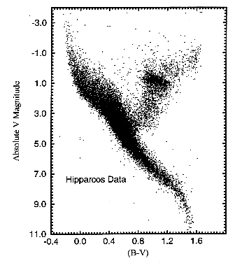
However, instead of plotting stars directly on the actual luminosity-temperature plane, an equivalent plot, known as a color-magnitude (CM) diagram is often used instead (such as the figure on the right). The reasons are as follows: | However, instead of plotting stars directly on the actual luminosity-temperature plane, an equivalent plot, known as a color-magnitude (CM) diagram is often used instead (such as the figure on the right). The reasons are as follows: | ||
Revision as of 22:02, 4 May 2012
Contents
Color-Magnitude Diagrams (in general)
The original version of this text copied from this site
There is a relationship between the luminosity & surface temperature based upon
- the initial mass of a star
- its age
- its composition (usually a small effect)
Note that the rest of this page assumes you know what photometry and magnitudes are.
The initial studies of the relation between the absolute magnitudes (equivalent to luminosities) and spectral types (broadly equivalent to temperature) were performed (independently) by Ejnar Hertzsprung (Danish, 1905) and Henry Norris Russell (USA, 1913). Thus the plots of luminosity vs. temperature (or absolute magnitudes vs. spectral types) are often referred to as Hertzsprung-Russell (or HR) diagrams.
Stars of different initial masses follow different evolutionary paths within the luminosity-temperature plane (ex: see this). However, stars spend most of their hydrogen-burning lives within a relatively narrow band within the luminosity-temperature plane known as the Main Sequence. You can use this fact to get relative ages for clusters based on the shape of the main sequence ("main sequence fitting").
However, instead of plotting stars directly on the actual luminosity-temperature plane, an equivalent plot, known as a color-magnitude (CM) diagram is often used instead (such as the figure on the right). The reasons are as follows:
To first order, the light emitted by a star is a black body. Thus, rather than actually measure & plot (in Kelvin) the temperature of every star, it is MUCH easier and quicker to simply measure & plot the ratio of the intensity of the star in two spectral bands. This ratio is then directly related to the black body function and hence temperature. For primarily historical reasons, the ratio is usually expressed as the difference (in magnitudes) between two standard (optical/IR) spectral bands and is known as the color. Traditionally, the most commonly used color is the difference between the B and V bands (centered at 440 & 550 nm, respectively) and usually written as simply B - V.
Similarly, rather than actually measure & plot (in W/m^2) the total flux of every star, it is MUCH easier to simply measure & plot the flux in a standard (optical/IR) spectral band. Again since the emitted spectra are black bodies, this is directly related to the total flux. Traditionally, the most commonly used band is the V band (550 nm) and usually written as simply V.
Hence, typically CM diagrams are used rather than HR diagrams. For example
- if the distances to all the stars have been determined, then this might be a plot of B - V versus absolute V band magnitude.
- if the distances to all the stars have NOT been determined (say for a star cluster), then this might be a plot of B - V versus apparent V band magnitude.
These are both equivalent to plots of luminosity vs. temperature.
Near- and mid-infrared measurements (such as those taken with Spitzer) can be combined with optical data or used on their own to make CMDs.
Other Web Resources for these concepts and more
- http://www.noao.edu/education/arbse/arpd/oc
- http://www.astro.washington.edu/labs/clearinghouse/labs/Clusterhr/cluster.html
- http://orca.phys.uvic.ca/astrocourses/a120/A120/lab5.html
- http://cas.sdss.org/dr4/en/proj/advanced/hr/
- http://lcogt.net/en/book/observing-open-clusters-and-making-h-r-diagrams
Color-Color Diagrams (in general)
In order to compare CM diagrams of two different clusters at two different distances, you need to know the distance to each cluster in order to calculate the absolute magnitude from the apparent magnitude. But what if you don't know the distances to the clusters? Wouldn't it be nice to still be able to learn something about the clusters, even if you don't know the distances? (Because distances are hard to get!)
The magnitude of a star is related to the log of the flux. Therefore, a color (or the difference of two magnitudes) is related to the ratio of the fluxes. When you take the ratio of the fluxes of the same star, the distance cancels out. (Go get the math from the Photometry page and work that out if you don't believe me!) The point is that colors are independent of distances! So a color-color plot is also independent of distance.
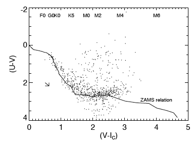
By studying main-sequence clusters, we can determine the locations of "normal" stars (or other objects) in nearly any color-color space. Then, stars (or other objects) that have colors different than these normal objects stand out. For example, in the plot on the left, the relationship between these two colors (U-V and V-I) for normal stars is indicated by the line marked "ZAMS Relation." Normal stars are clumped along this line. Stars significantly above this line are brighter than expected in U-V given their observed color in V-I. This plot was used in Rebull et al. (2000) to argue that those stars, those that are brighter than expected in U-V, are likely cluster members.
Near- and mid-infrared measurements (such as those taken with Spitzer) can be combined with optical data or used on their own to make CC diagrams.
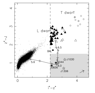
Color-color plots can be used to separate objects of different types, such as distinguishing galaxies from stars. The plot on the right comes from Fig.2 from Fan et al. 2001, AJ, 122, 2833, and was used to show how the quasars (lower right) are different than brown dwarfs (top) and more boring objects (cluster of points).
Other web resources
- how different bands you use may affect the color you see in your images, or the color that is reported for an object: http://blogs.discovermagazine.com/badastronomy/2010/01/29/the-case-of-the-brown-star-thats-really-red-or-possibly-blue/
- http://cas.sdss.org/dr4/en/proj/basic/color/colorcolordiagram.asp
Color-Color plots and Young Stars
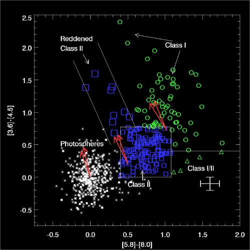
A color-color diagram in general is a useful tool in (a) finding the young stars, and (b) making a guess at the age of young stars. Using Spitzer colors, we can do this more easily than in many other color-color spaces.
Here is an example of a color-color plot using IRAC colors. By making models of stars, astronomers have determined that a star's position on this graph is related to its age since the star’s position on the graph is related to how warm or cool it is. Stars start out as cool (or red) and become warmer (bluer), therefore they shift positions on the diagram as they age.
In the diagram, "photospheres" means plain stars, e.g., stars without circumstellar dust. (They could be older brethren of the stars elsewhere in the diagram, or they could be unrelated foreground or background objects.) There is a sample set of error bars in the lower right, so that you can see how much measurement error might move the points around. The red arrows show an indication of the direction the points could move when subject to interstellar reddening - e.g., from clouds of gas and dust often found in star-forming regions (larger scale -- and at a different temperature and density -- than the circumstellar gas and dust in the disk).
--Class 0: these are very young stars, still buried deep inside their cocoon of gas. These do not appear on the diagram at left, because they are so buried, they do not appear even at 3.6 or 4.5 microns.
--Class I: these are protostars surrounded by an infalling envelope of gas.
--Class II: these protostars, now in the T-Tauri stage, have developed protoplanetary disks.
--Class III: these are nearly fully developed stars, with just a remnant disk (and possibly planets) surrounding them.
This page has more information about these evolutionary classes of young stars.
Questions to think about and things to try
Use real data from one of the Spitzer star-forming regions and see if you can construct other color-color diagrams that cause some objects to be in different clumps than most of the rest of the objects. If you do a literature search, you might find real-life examples of Spitzer color-color diagrams being used to separate young stars from other stars. (Hint: try some of the papers mentioned in the IR section of Finding cluster members, but you should feel encouraged to branch out and try other papers, since there are LOTS of color-color combinations, and they all tell you different things.)
